 Fireblaze
 Learning Guides
The Art of Storytelling with Data Visualizations: Turning Data into Meaningful Insights
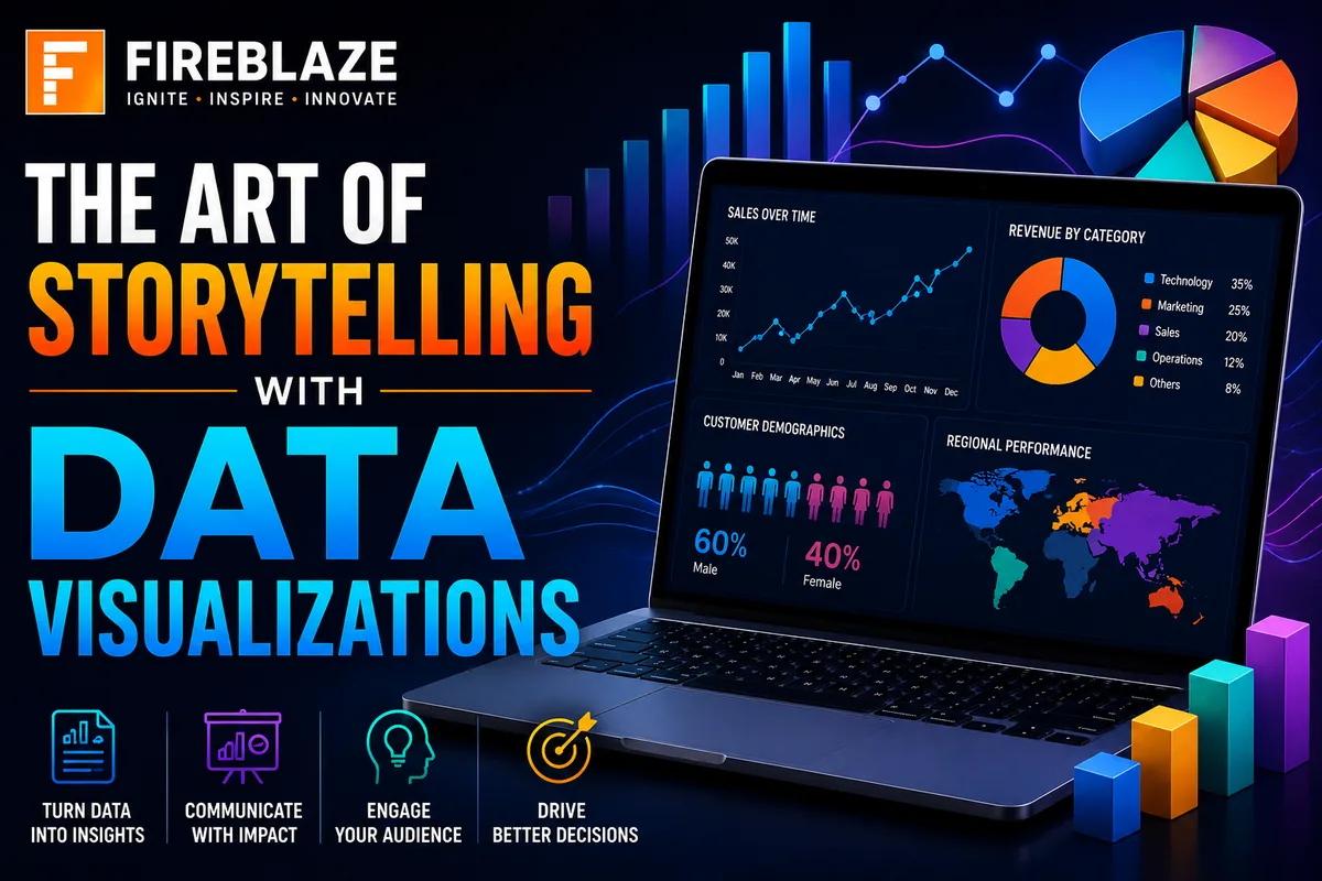
Data has become one of the most valuable assets in modern organizations. Businesses generate massive amounts of information every day from customers, transactions, marketing campaigns, operations, and digital platforms.
However, raw data alone does not create value.
The real value comes from transforming data into meaningful insights that people can understand and act upon.
This is where:
Data Storytelling\nand
Data Visualization\nplay a critical role.
Effective visualizations help simplify complex information, highlight important trends, and communicate business insights clearly to decision-makers.
In this guide, you'll learn:
What data storytelling is
Why data visualization matters
Principles of effective storytelling
Types of visualizations
Dashboard design concepts
Real-world applications
Best practices for Data Science and Analytics
What is Data Storytelling?
Data Storytelling is the process of combining:
Data
Visualizations
Narrative
to communicate insights effectively.
Instead of presenting numbers alone, storytelling explains:
What happened
Why it happened
What it means
What actions should be taken
Good storytelling transforms data into a meaningful business message.
What is Data Visualization?
Data Visualization is the graphical representation of information using:
Charts
Graphs
Dashboards
Maps
Infographics
Visualizations make it easier to:
Understand trends
Identify patterns
Compare performance
Detect anomalies
Humans process visual information much faster than raw tables and spreadsheets.
Why Data Storytelling Matters
Organizations often collect huge amounts of data.
Without effective storytelling:
Reports become difficult to understand
Important insights may be missed
Decision-making becomes slower
Data storytelling helps:
Improve communication
Support decision-making
Increase audience engagement
Drive business actions
Components of Effective Data Storytelling
Successful storytelling combines three key elements.
Data
The foundation of every story.
Data should be:
Accurate
Relevant
Reliable
Well-structured
Visuals
Visual elements help simplify information.
Examples:
Bar Charts
Line Charts
Pie Charts
Dashboards
Heatmaps
Narrative
Narrative explains the meaning behind the data.
It answers:
What happened?
Why did it happen?
What should we do next?
Why Visualizations Are Powerful
Visualizations help people:
Understand information quickly
Identify trends
Detect unusual behavior
Compare performance metrics
Example:
A spreadsheet with 10,000 rows may be difficult to analyze.
A simple dashboard can reveal insights within seconds.
Choosing the Right Visualization
Different charts serve different purposes.
Bar Chart
Best for:
Comparing categories
Sales comparisons
Revenue analysis
Example:
Sales across multiple regions.
Line Chart
Best for:
Time-series analysis
Growth tracking
Trend visualization
Example:
Monthly revenue growth.
Pie Chart
Best for:
Percentage distribution
Market share analysis
Use only when categories are limited.
Scatter Plot
Best for:
Correlation analysis
Relationship identification
Example:
Advertising spend vs sales revenue.
Heatmap
Best for:
Pattern identification
User activity analysis
Website analytics
Geographic Maps
Best for:
Regional performance
Location-based insights
Example:
State-wise sales analysis.
Common Data Storytelling Process
Step 1: Define the Objective
Ask:
What business question are we solving?\nExamples:
Why are sales declining?
Which customers are leaving?
Which products perform best?
Step 2: Collect Relevant Data
Gather data from:
Databases
CRM systems
Business applications
APIs
Data warehouses
Step 3: Analyze the Data
Perform:
Data Cleaning
Exploratory Data Analysis
Trend Analysis
Statistical Analysis
Step 4: Create Visualizations
Select appropriate charts and dashboards.
Focus on clarity.
Step 5: Build the Narrative
Explain:
Key findings
Business impact
Recommendations
Data Storytelling in Business Intelligence
Business Intelligence teams use storytelling to help leaders make decisions.
Examples:
Revenue reporting
Customer analytics
Operational monitoring
KPI tracking
Popular BI tools:
Power BI
Tableau
Looker Studio
Qlik Sense
Real-World Applications of Data Storytelling
Sales Analytics
Visualizations help identify:
Top-performing products
Revenue trends
Regional sales performance
Customer Analytics
Organizations analyze:
Customer retention
Customer churn
User engagement
Storytelling helps explain customer behavior patterns.
Marketing Analytics
Visualizations help measure:
Campaign performance
Conversion rates
Return on investment (ROI)
Financial Analytics
Used for:
Revenue forecasting
Budget analysis
Risk management
Healthcare Analytics
Applications include:
Patient monitoring
Disease trend analysis
Hospital performance reporting
Dashboard Storytelling
Dashboards are one of the most powerful storytelling tools.
Good dashboards:
Highlight key metrics
Show trends clearly
Support decision-making
Reduce information overload
Characteristics of Effective Dashboards
Simplicity
Avoid unnecessary visual elements.
Clarity
Information should be easy to understand.
Consistency
Use consistent layouts and formats.
Relevance
Focus only on important business metrics.
Common Dashboard KPIs
Examples:
Revenue
Customer Retention
Conversion Rate
Profit Margin
Customer Satisfaction Score
Storytelling in Data Science
Data Scientists use storytelling to explain:
Machine Learning results
Predictive models
Customer insights
Business recommendations
A highly accurate model is valuable only if stakeholders understand its impact.
Data Storytelling in Machine Learning
Machine Learning projects often generate complex outputs.
Storytelling helps explain:
Model performance
Accuracy metrics
Business outcomes
Risk factors
Examples:
Churn prediction
Fraud detection
Demand forecasting
Common Mistakes in Data Visualization
Too Much Information
Overloaded dashboards confuse users.
Wrong Chart Selection
Using incorrect charts can misrepresent data.
Poor Color Usage
Excessive colors reduce readability.
Lack of Context
Charts should explain:
Why the insight matters\nnot just display numbers.
Best Practices for Data Storytelling
Know Your Audience
Executives, managers, and analysts require different levels of detail.
Focus on Business Questions
Every visualization should answer a specific question.
Highlight Key Insights
Make important findings immediately visible.
Keep Visuals Simple
Avoid unnecessary complexity.
Use Clear Labels
Titles and labels should be easy to understand.
Common Interview Questions
What is Data Storytelling?
Data Storytelling combines data, visualizations, and narrative to communicate insights effectively.
Why is Data Visualization Important?
It helps simplify complex information and supports better decision-making.
What Makes a Good Dashboard?
A good dashboard is:
Clear
Simple
Relevant
Actionable
Difference Between Reporting and Storytelling
| Reporting | Storytelling |
|---|---|
| Shows data | Explains insights |
| Focuses on metrics | Focuses on decisions |
| Descriptive | Action-oriented |
What Are KPIs?
KPIs (Key Performance Indicators) are measurable metrics used to evaluate performance.
Career Opportunities Related to Data Visualization
Professionals working with data storytelling include:
Data Analysts
Business Analysts
Data Scientists
BI Developers
Analytics Consultants
Product Analysts
Why Data Storytelling is a Valuable Skill
Technical skills alone are not enough.
Organizations need professionals who can:
Analyze data
Generate insights
Communicate findings effectively
Data storytelling bridges the gap between technical analysis and business decision-making.
Final Thoughts
The art of storytelling with data visualizations goes beyond creating attractive charts. It involves transforming raw data into meaningful stories that help people understand trends, make informed decisions, and take action.
Whether you're working in Data Science, Analytics, Business Intelligence, Marketing, Finance, Healthcare, or Artificial Intelligence, strong data storytelling skills can significantly improve the impact of your analysis and help organizations unlock the true value of data.
Mastering data visualization and storytelling will make you a more effective analyst, Data Scientist, and business problem solver in today's data-driven world.
Keep Reading
Related Articles
Learning Guides
Introduction to Computer Vision: A Beginner’s Guide
Discover the basics of Computer Vision, a rapidly growing field of Artificial Intelligence that enables machines to understand images and videos. Expl
All About PyCaret: Conversation with Mr. Moez Ali and Mr. Aniruddha Kalbande | EP-06
Explore PyCaret and its impact on machine learning development through an insightful conversation with PyCaret creator Moez Ali and AI expert Aniruddh
What is Data Mining? Complete Guide for Beginners
Learn what Data Mining is, how it works, key techniques, tools, applications, advantages, challenges, and its role in Data Science, Machine Learning,