 Fireblaze
 Learning Guides
Data Visualization Using Plotly in Python
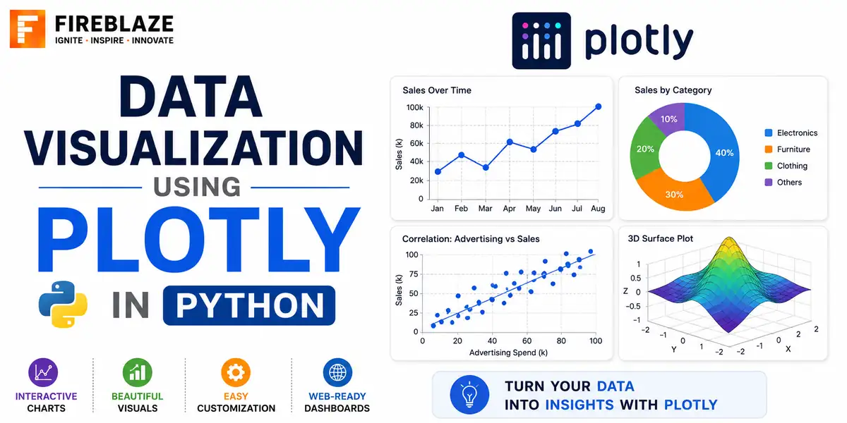
Quick answer: Learn how to create interactive charts in Python using Plotly, including line charts, bar charts, scatter plots and dashboards, with example code.
Why Use Plotly Instead of Matplotlib?
Plotly creates interactive charts by default, letting viewers hover for details, zoom, and pan, directly in a web browser or Jupyter notebook, without any extra code. Matplotlib produces static images, which are simpler but offer none of this interactivity out of the box.
Installation
pip install plotly
A Basic Line Chart
import plotly.express as px
import pandas as pd

df = pd.DataFrame({
    'month': ['Jan', 'Feb', 'Mar', 'Apr'],
    'sales': [12000, 15000, 11000, 18000]
})

fig = px.line(df, x='month', y='sales', title='Monthly Sales')
fig.show()
Bar Chart
fig = px.bar(df, x='month', y='sales', color='month', title='Sales by Month')
fig.show()
Scatter Plot
fig = px.scatter(df, x='marketing_spend', y='sales', size='sales', color='region',
                  hover_data=['month'])
fig.show()
hover_data adds extra fields visible only when hovering over a point, a genuinely useful feature for exploring a dataset interactively that a static chart cannot replicate.
Pie Chart
fig = px.pie(df, names='month', values='sales', title='Sales Distribution')
fig.show()
Combining Multiple Charts
from plotly.subplots import make_subplots
import plotly.graph_objects as go

fig = make_subplots(rows=1, cols=2, subplot_titles=('Sales Trend', 'Sales by Region'))
fig.add_trace(go.Scatter(x=df['month'], y=df['sales']), row=1, col=1)
fig.add_trace(go.Bar(x=df['region'], y=df['sales']), row=1, col=2)

fig.show()
Exporting Charts
fig.write_html('sales_chart.html')     # interactive HTML file
fig.write_image('sales_chart.png')     # static image, requires the kaleido package
Plotly vs Matplotlib vs Seaborn
| Plotly | Matplotlib / Seaborn |
|---|---|
| Interactive by default | Static images |
| Better suited to dashboards and web sharing | Better suited to publication-quality static figures |
| Slightly more verbose for very simple charts | Very quick for simple exploratory plots |
Common Interview Questions
What is the main advantage of Plotly over Matplotlib?
Plotly charts are interactive by default, allowing hovering, zooming and panning without extra code, which is particularly valuable for dashboards and reports shared with non-technical stakeholders.
When might you still choose Matplotlib over Plotly?
For quick, simple exploratory plots during initial analysis, or when producing static, publication-quality figures where interactivity is not needed.
FAQ
Frequently Asked Questions
Why would you use Plotly instead of Matplotlib?
Plotly charts are interactive by default, allowing hovering, zooming and panning without extra code, making it well suited to dashboards and reports shared with others.
Can Plotly charts be exported as static images?
Yes, using fig.write_image(), which requires the additional kaleido package, alongside fig.write_html() for an interactive HTML version.
Is Plotly better than Seaborn for data visualization?
Neither is universally better. Seaborn is often faster for quick, simple exploratory plots. Plotly is better suited to interactive dashboards and reports intended for wider, non-technical sharing.
Keep Reading
Related Articles
Learning Guides
INNER JOIN in SQL with Examples: Complete Beginner's Guide
Learn INNER JOIN in SQL with practical examples, syntax, interview questions, and real-world use cases. A complete beginner-friendly SQL JOI
Learning Guides
OUTER JOIN in SQL: Complete Guide with Examples for Beginners
Master OUTER JOIN in SQL with practical examples and real-world scenarios. Learn LEFT JOIN, RIGHT JOIN, FULL OUTER JOIN, syntax, use cases,
Learning Guides
Multi-Row Functions in SQL: Complete Guide with Examples
Learn multi-row (aggregate) functions in SQL including SUM, AVG, COUNT, MIN, MAX, GROUP BY and HAVING, with practical examples, NULL handlin